MBTA MBTA MBTA MBTA MBTA MBTA MBTA MBTA MBTA MBTA MBTA MBTA MBTA MBTA MBTA MBTA MBTA MBTA MBTA MBTA MBTA MBTA MBTA MBTA MBTA MBTA MBTA MBTA MBTA MBTA MBTA MBTA
Because everyone feels lost sometimes.


A human-centered mobile kiosk for public transit systems
Problem: Visitors often find the MBTA confusing due to unclear signage and inconsistent delay updates.
Impact: This leads to stress, missed trains, and reliance on station staff
Need: A visual navigation assistant that helps users quickly understand where to go in real time.


I designed a mobile, modular transit kiosk that serves as a centralized point for wayfinding, service updates, and real-time decision support. The kiosk aims to reduce confusion of commuters and dependance on MBTA staff.
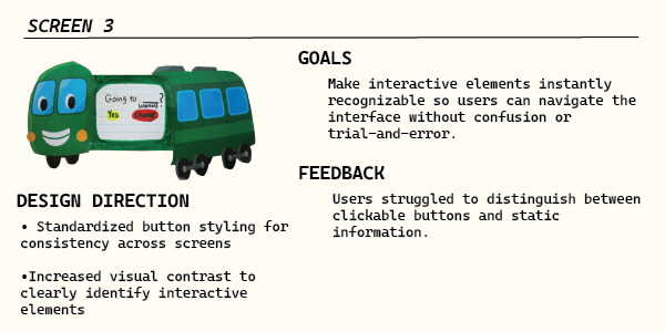
Designed with 4 pillars in mind:
1. Clarity in visual communication
2. Confidence through real-time guidance
3. Accessibility across diverse user-needs
4. Efficiency in movement and decision-making
This low-fidelity prototype was presented to regular users of the MBTA.
They were instructed to click-through the screens without my guidance. I asked each user to think out loud, while I documented both their actions and verbal reactions.
After completing the flow, I collected open-ended feedback, then shared the design's intent, and invited any additional suggestions.
The final outcome was largely informed by these observationsThe final system includes a physical kiosk, a guided mobile interface, and a take-away receipt to support users at different levels of comfort with technology.
Accessibility features include large text, audio guidance, multilingual support, and a fallback option to call or request help from an MBTA agent.
The mobile assistant uses clear step-by-step directions, line color cues, and minimal language to reduce cognitive load for tourists and elderly riders.
Directions can be taken off-platform via text or printed receipt, allowing users to continue navigating without relying on the kiosk or a smartphone.


01 Expand Accessibility Features
Show users, if prompted, each stations accessibility features and where they are located: elevators, ramps, emergency exits.
02 Include an MBTA Map
03 Update Routes Based on Delays
Offer another way for users to visualize the directions. Show a live diagram, emphasizing which stop they get off at - gives users a chance to learn how to read standard MBTA maps for future use
Provide users with an alternative, faster route [bus, alternative T line] in case of delay. Relay accurate delay times and ETAs.